All Designs , writings and illustrations or pictures are created by me,unless clearly specified otherwise,
most of this stuff is hardly what you may call personal, in a way they are a portrait of how i see daily life, and what goes on in my head, which on the other hand make them quite intimate, some could call this some sort of an exhibition for my combined creative media, i personally think of it as a book.
I am sometimes labeled as "morbid", you have been warned!
Sunday, April 02, 2006
31st Mar 2006 - goning on 30 ... IHMLAIWTD
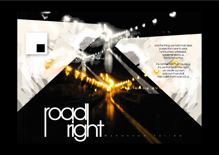
the streets of Cairo.. others to be added to this post, soon.
2 comments:
Anonymous
said...
Thats a very nice one, but in my opinion Mond, u should minimize the logo (the square) on the left side a little bit coz it catches the eyes more that the writing on the right, or u can desolve it a little bit with the background. thats just my opinion , it may not be correct anyway. but the post is wonderfull. keep it up dear.
always politically correct arn't we :P thank you very much for the critique, i'll keep it in mind for the rest of the collection, check this post again sometime around next week.
2 comments:
Thats a very nice one, but in my opinion Mond, u should minimize the logo (the square) on the left side a little bit coz it catches the eyes more that the writing on the right, or u can desolve it a little bit with the background. thats just my opinion , it may not be correct anyway. but the post is wonderfull. keep it up dear.
always politically correct arn't we :P
thank you very much for the critique, i'll keep it in mind for the rest of the collection, check this post again sometime around next week.
Post a Comment